I don't often post reviews of my work but this round up of different versions of "East of the Sun and West of the Moon" by Tim J Myers in the Los Angeles Review of Books was just so nice I had to share it. Many thanks Tim.
"FOLKTALES, IT SEEMS TO ME, generally include two crucial elements: compelling wisdom about some fundamental human challenge, and some aspect of wonder. They offer both the practical and the transcendent, a combination which covers a great deal of what it means to be human. East of the Sun and West of the Moon, a Norwegian folktale, (based on Apuleius's "Cupid and Psyche") has been retold numerous times for children, but one version in particular stands head and shoulders above the rest –precisely because it so faithfully and passionately renders this archetypal blend of wisdom and wonder.
There are pitfalls, naturally, in retelling and illustrating such narratives. One is the temptation to couch the story in ways perceived as more appropriate for children. But this is usually a mistake, as Gillian Barlow's cozy East o’ The Sun & West o’ The Moon or Tanya Robyn Batt's The Princess and the White Bear King, illustrated by Nicoletta Ceccoli, reveal. I don't mean that these illustrations are unskillful or unevocative, but when the great bear is presented like a stuffed animal, with mildness of expression and fluffiness of coat, an essential element of the story is neutralized, and even children will tend to lose interest. Bruno Bettelheim and Disney, among others, understand that fairy tales are serious business, to children as well as adults, and are, generally speaking, only weakened when too much is smoothed over. Often enough, wonder walks the tightrope between safety and fear.
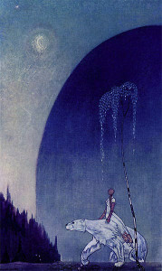
Danish artist Kay Nielsen's 1914 illustrations are rich and certainly take the story seriously, and his eclectic style is unique and compelling. But Nielsen's human and animal figures, as well as certain features of his landscapes, are slenderized and elongated to the point that they seem mere cut-outs. What works in Modigliani doesn't work here, partly because it violates the essence of the fairy tale. The best stories, in poet Marianne Moore's phrase, present "imaginary gardens with real toads in them." Over-stylized figures rob us of the warm flesh-and-blood quality of a story that matters. The scale tips too far in the direction of wonder.
Mercer Mayer's version – translated from Norwegian by George Dasent in 1910 – is a classic. The illustrations are gorgeous. But while I love Mayer’s work (Everyone Knows What a Dragon Looks Like is, in my estimation, an underappreciated masterpiece), I find his retelling suffers from an overly elaborate plot and the inclusion of elements – like demons, a unicorn, a fire salamander, and a talking tree – that suggest, again, too much seeking after wonder.
Which brings us to Nancy Willard's unique 1998 version, illustrated by the superb Barry Moser. My admiration for Willard is immense; I think her name should be shouted from the rooftops. Yet while I understand the goal she pursued here, her verse play is too prosaic. Although her poetry-tinged dialogue is beautiful and forcefully idiomatic, and she fixes some glaring plot problems, her attempt to contemporize the story falls flat for me. The same applies to Moser's illustrations. As skillful as they are, they actually come off as mildly disappointing; the story has been robbed of its wonder.
But to my surprise I found a version so stunningly executed, so balanced in its approach, and so electric with feeling that I find myself in the rare position of awarding a first prize. In 1991 Irish artist PJ Lynch, using Dasent's translation, produced a version for the ages.
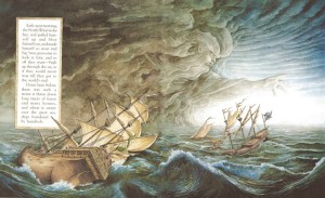
As a professional storyteller, I often use a simple "trick" to deepen my telling: I pretend that the folktale I'm telling is actually true. There's something of this in Lynch's art; "East of the Sun and West of the Moon" seems to beat in his blood. We can feel the freezing rain that soaks the sod roof of the poor family's mountain hut when the great bear first arrives, and the mix of fear and courage in the young woman as she rides off on his back. The bear himself is presented with luminous realism – huge, shaggy, dead-eyed, simultaneously menacing and wondrous. When, in human form, he comes to his bride’s bed in the darkness, Lynch's illustration gives us both cold, eerie moonlight and a warm potential for intimacy. When she wakes in the wood alone after the prince has fled, the crowding of the close-set trees and the dark heaviness of their boles evoke her desolation. I first read this story as a child, and it was the title and the young woman's traveling on the backs of the Four Winds that most captivated me; Lynch's Winds, I'm delighted to say – monumental, furious, and ethereal all at once – are breathtaking. His Troll Princess is perfect too; hideous, frightening, and ridiculous, exactly as a troll would be. And the cover image, where the young woman stands amid roaring winds and churning seas before the foreboding heights of the trolls' castle, is charged with both wonder and a lesson for living – since in real life one lover must often pursue another over long psychological distances, sometimes at great odds, for a true marriage to be built.
The land east of the sun and west of the moon, Lynch helps us see, is both impossibly far away and here at the center of our own hearts, if we have the courage to seek it."
¤


This review is very edifying for me. Great because it contrasts effective folk and fairy tale illustration with the impotent versions--all without sensationalism or cruelty. Thanks for posting, and for the artwork you create.
ReplyDeleteMany thanks for that Cranky Bird. Tim was pretty positive about some of the other versions though. Still I'm delighted he liked mine best.
ReplyDeleteBest regards PJ
your work is so beautiful I search a work like yours, can you help me ?
ReplyDeleteand in italy is so difficult have your book on Alice....
thank so much
This comment has been removed by the author.
ReplyDeleteSorry tried to edit - accidentally deleted - but this has long been one of my favorite picture books! I came across it at the library as a child and kept checking it out again an again. Later I tracked my own copy for my kids and its a favorite in our house. Congratulations on a great review!
ReplyDeleteMany thanks Michelarosa and Catherine, I really appreciate those kind comments.
ReplyDeleteDelighted you eventually got a copy of
""East of the Sun and West of the Moon", Catherine.....I think it's due a reprint soon.
I haven't done a version of Alice , Michelarosa. I just did a once-off image for an exhibition in Paris.
I will be doing that image as a poster when I get a bit of time.
Best regards
PJ
So delighted to read the review, and even more to hear that there will be a reprint soon! I was so sad when I lost my copy. That illustration where she holds the candle up to see him is worth a whole instruction book on light, colour and mood in the medium.
ReplyDeleteThanks so much Mahala.
ReplyDeleteWhen I said it was due a reprint I was being more hopeful than anything else. However I wil have a word with the publisher.
Meantime I am sure you can get a copy from Amazon or eBay.
Best wishes PJ
Great read thankks
ReplyDelete